Porcelain Madness: Difference between revisions
(typo patrol) |
(typo patrol) |
||
| Line 6: | Line 6: | ||
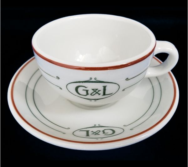
File:Mayer-G-and-L-red-green-white-c-and-s.jpg|A mystery cup and saucer from the early 20th century. It was made by the Mayer China company and dates to the era of hand-striping, probably around the 1910s to 1920s, but the "G & L" logo turns up no restaurants, tea rooms, academic institutions, churches, fraternal organizations, factories, fire departments, or other of the "usual suspects" who customarily had their own sets of restaurantware. | File:Mayer-G-and-L-red-green-white-c-and-s.jpg|A mystery cup and saucer from the early 20th century. It was made by the Mayer China company and dates to the era of hand-striping, probably around the 1910s to 1920s, but the "G & L" logo turns up no restaurants, tea rooms, academic institutions, churches, fraternal organizations, factories, fire departments, or other of the "usual suspects" who customarily had their own sets of restaurantware. | ||
File:Spritzdekor-blue-plums-cake-plate-germany.jpg|"Spritdekor" is German for " | File:Spritzdekor-blue-plums-cake-plate-germany.jpg|"Spritdekor" is German for "airbrush' -- and this is a German porcelain spritzdekor cake plate fitted into a nickel-plated holder with handles. The image, airbrushed in shades of indigo blue, depicts two leafy branches of Damson Plums ("Kriechen-Pflaume") in full fruit. I bought this cake plate on eBay years ago, and it came all the way from Germany. It is very nearly identical to a cake plate that my German-Jewish grandmother Ida had in her home. | ||
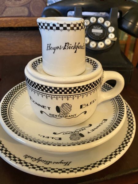
File:BandW-RestaurantWare-Forum.jpg|The stack of vintage checkerboard restaurant ware on which i ate my breakfast on January 13th, 2021. | File:BandW-RestaurantWare-Forum.jpg|The stack of vintage checkerboard restaurant ware on which i ate my breakfast on January 13th, 2021. | ||
Revision as of 19:13, 11 November 2024
Welcome to Porcelain Madness, a decorative annex to The Mystic Tea Room, where every piece of chinaware tells a story.
A mystery cup and saucer from the early 20th century. It was made by the Mayer China company and dates to the era of hand-striping, probably around the 1910s to 1920s, but the "G & L" logo turns up no restaurants, tea rooms, academic institutions, churches, fraternal organizations, factories, fire departments, or other of the "usual suspects" who customarily had their own sets of restaurantware.
"Spritdekor" is German for "airbrush' -- and this is a German porcelain spritzdekor cake plate fitted into a nickel-plated holder with handles. The image, airbrushed in shades of indigo blue, depicts two leafy branches of Damson Plums ("Kriechen-Pflaume") in full fruit. I bought this cake plate on eBay years ago, and it came all the way from Germany. It is very nearly identical to a cake plate that my German-Jewish grandmother Ida had in her home.
A small but mighty piece of restaurant ware from my collection. It is a butterpat from the Barbecue Inn in Waikiki, Hawaii Territory, made in the mid-1930s. The lettering is just amateurish enough to make me cringe, but the intention to hit the ultra-moderne-deco mark is so sincere that i am charmed. The Barbecue Inn was founded sometime after 1900 by Seihichi Shikata (1884-1931), born in Yokohama, Japan, and his wife Tsune Shikata (- 1932), born in Yamaguchi, Japan. When they died, the restaurant was carried on by their son Joseph Kiyoshi "Joe" Shikata (1906-1992), born in Waipahu, Hawaii. I think this butterpat dates from the era of the early proprietorship of Joe Shikata, circa 1932 - 1939. A 1933 advertisement lists the "Barbecue Inn at 2015 Kalakaua Ave., K. [Kiyoshi] Shikata, Mgr., Phone 91981."
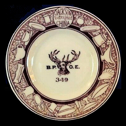
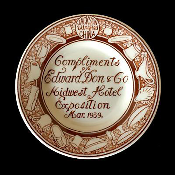
A Jackson Vitrified China butterpat made for the Benevolent and Protective Order of Elks, Lodge #349, Pride of Delaware, in Newark, Delaware. The Elks are a fraternal membership group that offers community building and charitable services. Elks greet one another with a cheerful, "Hello, Bill!" Their colour is purple and to them the 11th hour is the golden hour of recollection, the homecoming of those who wander, the mystic roll call of those who will come no more because, living or dead, an Elk is never forgotten, never forsaken.
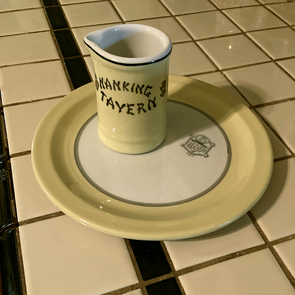
Preparing for breakfast with a vintage creamer and 6" plate. Eggs over easy and an English muffin are on the menu and will be complemented by this yellow and white service. The creamer was manufactured by Medalta Potteries of Medicine Hat, Alberta, Canada, and is back-stamped with the date-code 52, for 1952. It advertises the Nanking Tavern, a beloved Chinese restaurant which was located at the corner of Elizabeth and Hager streets in Toronto, Ontario, Canada. The plate is a mystery; it bears a conventional logo crest with a full-rigged sailing ship and the letters H MP H. The MP probably stands for a Scottish name, such as MacPherson or McPeak and the final H may possibly signify "Hotel" -- but precise identification has so far eluded me. In any case, the organization that used this crest was somewhere in the United States because the plate was made to order by Sterling China of East Liverpool, Ohio. The narrow rim and yellow / grey colourway give it a mid-century modern look and indeed its back-stamp date-code of A3 indicates that it was made in the year 1953.
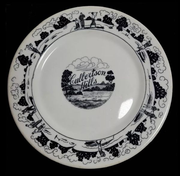
Here's a beautiful 6-inch black-and-white desert plate made by Warwick for the Culbertson Hills Golf Course in Edinboro, Pennsylvania in 1930, the year it opened. The artwork and lettering are superb -- and the same uncredited artist also produced a gorgeous matching brochure for the country club. I love lettering, i love art deco line art, i love cumulus clouds in art (and these are amazing clouds!) ... but i don't love the Culbertson Hills Golf Course, which advertised that it was "open to the pubic under restrictions which the company imposes, of course" -- specifically, that membership was offered "only to Gentile people." In other words, no Jews were allowed -- and neither were African Americans. I have no idea if or when Culbertson Hills changed its racial and religious exclusion policies, but this beautiful plate remains a symbol of the finest commercial art of its time, in the service of the ugliest discrimination of its time.
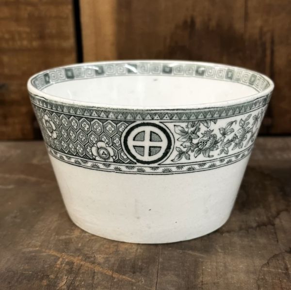
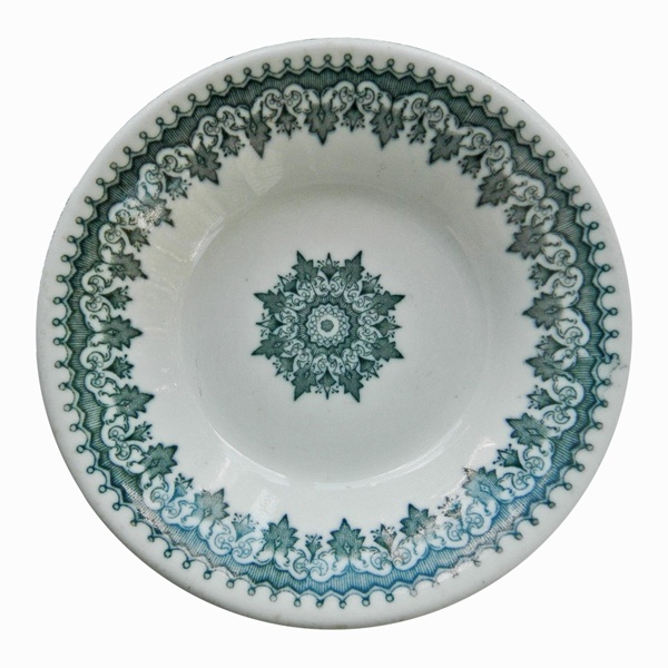
Green Circle-in-Cross Transferware Bowl, made in England, 19th century. I bought this piece of low-fire earthenware (not my usual semi-vitreous ware) because i am a fan of green-and-white ware (who isn't?) and the circle-in-cross is part of my own signature. Also, it is in the Aesthetic genre, which i love. I suppose it to be late 19th century.
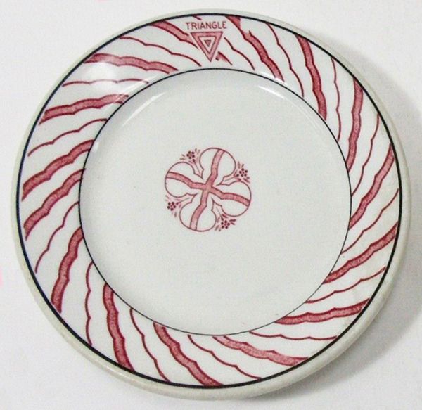
Sometimes the decoration of a retaurant plate is so amateurish or abnormal that it makes me wonder what the pottery company's distributor or rep thought of it. But, as they say, "The customer is always right," so here we have one of many bizarre examples of how the Toffenetti / Triangle restaurant chain in Chicago liked their plates to look in the early 1930s. The pottery company is Sterling, and i'll bet that some of the factory's decorators went home to migraine-inducing nightmares after 8 hours of looking at this pattern!
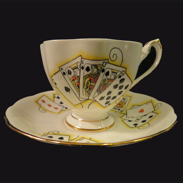
A fine bone china tea cup and saucer set made by Shore & Coggins in the Lady Luck pattern at the Queen Anne Pottery in Staffordshire, England. The maker's mark dates it to between 1959 and 1966. The decoration is of playing cards, the front showing a royal flush, while on the back is a picture of the joker; there is also a joker on the inside of the cup. A small sandwich plate came with each set and the sets were made in four colourways: blue (hearts), green (diamonds), pink (clubs), and yellow (spades). I love this tea set for reading tea leaves, especially if the sitter has a question about luck! For hundreds of images of tea leaf reading sets, and instructions in tasseomancy, see our sister-site, The Mystic Tea Room.
