Porcelain Madness: Difference between revisions
(preparing for upload) |
(added img) |
||
| Line 10: | Line 10: | ||
File:Barbecue-Inn-Waikiki-Butter-Pat-Hawaii-Territory-1930’s.jpg|A small but mighty piece of restaurant ware from my collection. It is a butterpat from the Barbecue Inn in Waikiki, Hawaii Territory, made in the mid-1930s. The lettering is just amateurish enough to make me cringe, but the intention to hit the ultra-moderne-deco mark is so sincere that i am charmed. The Barbecue Inn was founded sometime after 1900 by Seihichi Shikata (1884-1931), born in Yokohama, Japan, and his wife Tsune Shikata (- 1932), born in Yamaguchi, Japan. When they died, the restaurant was carried on by their son Joseph Kiyoshi "Joe" Shikata (1906-1992), born in Waipahu, Hawaii. I think this butterpat dates from the era of the early proprietorship of Joe Shikata, circa 1932 - 1939. A 1933 advertisement lists the "Barbecue Inn at 2015 Kalakaua Ave., K. [Kiyoshi] Shikata, Mgr., Phone 91981." | File:Barbecue-Inn-Waikiki-Butter-Pat-Hawaii-Territory-1930’s.jpg|A small but mighty piece of restaurant ware from my collection. It is a butterpat from the Barbecue Inn in Waikiki, Hawaii Territory, made in the mid-1930s. The lettering is just amateurish enough to make me cringe, but the intention to hit the ultra-moderne-deco mark is so sincere that i am charmed. The Barbecue Inn was founded sometime after 1900 by Seihichi Shikata (1884-1931), born in Yokohama, Japan, and his wife Tsune Shikata (- 1932), born in Yamaguchi, Japan. When they died, the restaurant was carried on by their son Joseph Kiyoshi "Joe" Shikata (1906-1992), born in Waipahu, Hawaii. I think this butterpat dates from the era of the early proprietorship of Joe Shikata, circa 1932 - 1939. A 1933 advertisement lists the "Barbecue Inn at 2015 Kalakaua Ave., K. [Kiyoshi] Shikata, Mgr., Phone 91981." | ||
File: | File:Scammells-sanitary-lunch-plate.jpg|Sanitary Lunch plate by Scammel's China of Trenton, New Jersey. Because an unsanitary lunch plate is a bit on the dark side, even for Trenton. | ||
File:Yellow-Restaurantware-Kitchen.jpg|Preparing for breakfast with a vintage creamer and 6" plate. Eggs over easy and an English muffin are on the menu and will be complemented by this yellow and white service. The creamer was manufactured by Medalta Potteries of Medicine Hat, Alberta, Canada, and is back-stamped with the date-code 52, for 1952. It advertises the Nanking Tavern, a beloved Chinese restaurant which was located at the corner of Elizabeth and Hager streets in Toronto, Ontario, Canada. The plate is a mystery; it bears a conventional logo crest with a full-rigged sailing ship and the letters H MP H. The MP probably stands for a Scottish name, such as MacPherson or McPeak and the final H may possibly signify "Hotel" -- but precise identification has so far eluded me. In any case, the organization that used this crest was somewhere in the United States because the plate was made to order by Sterling China of East Liverpool, Ohio. The narrow rim and yellow / grey colourway give it a mid-century modern look and indeed its back-stamp date-code of A3 indicates that it was made in the year 1953. | File:Yellow-Restaurantware-Kitchen.jpg|Preparing for breakfast with a vintage creamer and 6" plate. Eggs over easy and an English muffin are on the menu and will be complemented by this yellow and white service. The creamer was manufactured by Medalta Potteries of Medicine Hat, Alberta, Canada, and is back-stamped with the date-code 52, for 1952. It advertises the Nanking Tavern, a beloved Chinese restaurant which was located at the corner of Elizabeth and Hager streets in Toronto, Ontario, Canada. The plate is a mystery; it bears a conventional logo crest with a full-rigged sailing ship and the letters H MP H. The MP probably stands for a Scottish name, such as MacPherson or McPeak and the final H may possibly signify "Hotel" -- but precise identification has so far eluded me. In any case, the organization that used this crest was somewhere in the United States because the plate was made to order by Sterling China of East Liverpool, Ohio. The narrow rim and yellow / grey colourway give it a mid-century modern look and indeed its back-stamp date-code of A3 indicates that it was made in the year 1953. | ||
Revision as of 21:09, 10 November 2024
Welcome to Porcelain Madness, a decorative annex to The Mystic Tea Room, where every piece of chinaware tells a story.

File:Spritzdekor-blue-plums-cake-plate-germany.jpg "Spritdekor" is German for "airbrushed' -- and this is a German porcelain spritzdekor cake plate fitted into a nickel-plated holder with handles. The image, in shades of indigo blue, depicts two leafy branches of Damson Plums in full fruit. I bought this cake plate on eBay years ago, and it came all the way from Germany. It is very nearly identical to a cake plate that my German-Jewish grandmother Ida had in her home.
text

A small but mighty piece of restaurant ware from my collection. It is a butterpat from the Barbecue Inn in Waikiki, Hawaii Territory, made in the mid-1930s. The lettering is just amateurish enough to make me cringe, but the intention to hit the ultra-moderne-deco mark is so sincere that i am charmed. The Barbecue Inn was founded sometime after 1900 by Seihichi Shikata (1884-1931), born in Yokohama, Japan, and his wife Tsune Shikata (- 1932), born in Yamaguchi, Japan. When they died, the restaurant was carried on by their son Joseph Kiyoshi "Joe" Shikata (1906-1992), born in Waipahu, Hawaii. I think this butterpat dates from the era of the early proprietorship of Joe Shikata, circa 1932 - 1939. A 1933 advertisement lists the "Barbecue Inn at 2015 Kalakaua Ave., K. [Kiyoshi] Shikata, Mgr., Phone 91981."

Sanitary Lunch plate by Scammel's China of Trenton, New Jersey. Because an unsanitary lunch plate is a bit on the dark side, even for Trenton.
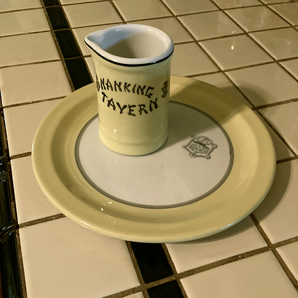
Preparing for breakfast with a vintage creamer and 6" plate. Eggs over easy and an English muffin are on the menu and will be complemented by this yellow and white service. The creamer was manufactured by Medalta Potteries of Medicine Hat, Alberta, Canada, and is back-stamped with the date-code 52, for 1952. It advertises the Nanking Tavern, a beloved Chinese restaurant which was located at the corner of Elizabeth and Hager streets in Toronto, Ontario, Canada. The plate is a mystery; it bears a conventional logo crest with a full-rigged sailing ship and the letters H MP H. The MP probably stands for a Scottish name, such as MacPherson or McPeak and the final H may possibly signify "Hotel" -- but precise identification has so far eluded me. In any case, the organization that used this crest was somewhere in the United States because the plate was made to order by Sterling China of East Liverpool, Ohio. The narrow rim and yellow / grey colourway give it a mid-century modern look and indeed its back-stamp date-code of A3 indicates that it was made in the year 1953.
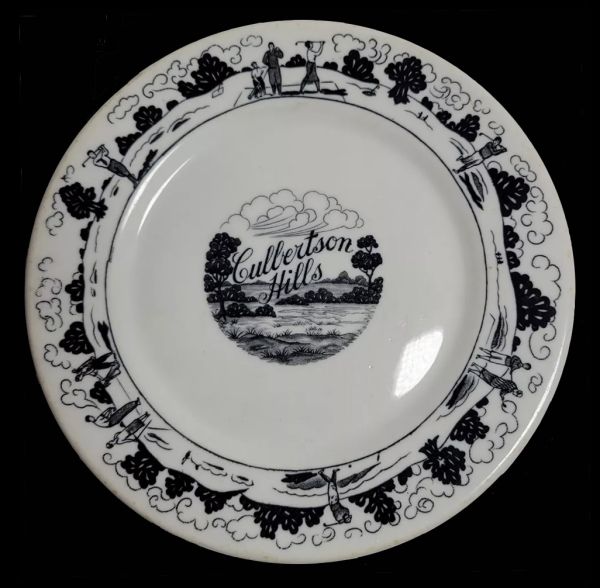
Here's a beautiful 6-inch black-and-white desert plate made by Warwick for the Culbertson Hills Golf Course in Edinboro, Pennsylvania in 1930, the year it opened. The artwork and lettering are superb -- and the same uncredited artist also produced a gorgeous matching brochure for the country club. I love lettering, i love art deco line art, i love cumulus clouds in art (and these are amazing clouds!) ... but i don't love the Culbertson Hills Golf Course, which advertised that it was "open to the pubic under restrictions which the company imposes, of course" -- specifically, that membership was offered "only to Gentile people." In other words, no Jews were allowed -- and neither were African Americans. I have no idea if or when Culbertson Hills changed its racial and religious exclusion policies, but this beautiful plate remains a symbol of the finest commercial art of its time, in the service of the ugliest discrimination of its time.
- Mobile-Oil-Pegasus-Plate-and-Saucer.jpg
A tea cup and saucer made for the Mobile Oil company, featuring their iconic Red Pegasus logo. This was used in one of their many cafeterias, either on land or on an oil rig offshore. The pottery company is Shenango, the time ... mid-20th century.
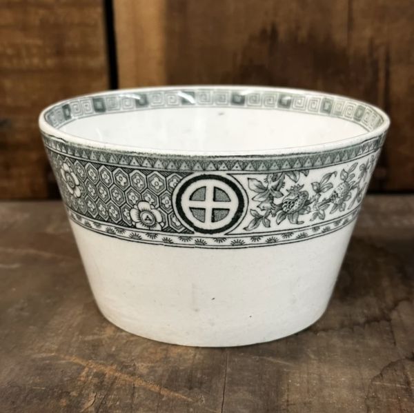
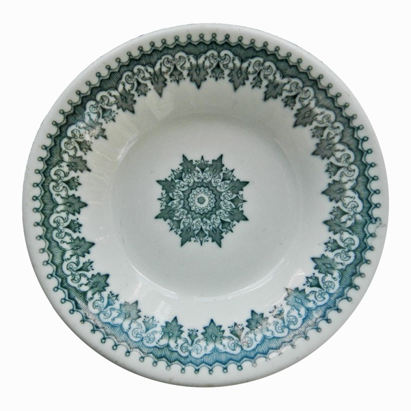
Green Circle-in-Cross Transferware Bowl, made in England, 19th century. I bought this piece of low-fire earthenware (not my usual semi-vitreous ware) because i am a fan of green-and-white ware (who isn't?) and the circle-in-cross is part of my own signature. Also, it is in the Aesthetic genre, which i love. I suppose it to be late 19th century.

Carr Vitrified China Advertising Butterpat. Sample butterpats were given away by restaurantware manufacturers during the inter-war period. This one is just a bit oversized for the usual butterpat, but it is certainly too small to qualify as a plate. It probably dates to the late 1930s.
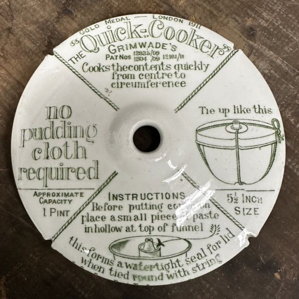
Grimwade's Pudding Cooker, Lid, made in England.
A Greenwood Monkey Dish in the ever-popular and much copied leaf-and-ball design made by many pottery companies over the years, and sometimes known as "Richmond" or "Dixon" among dealers. This is a early example, with the Greenwood name impressed into the clay rather than applied as a underglaze decal.
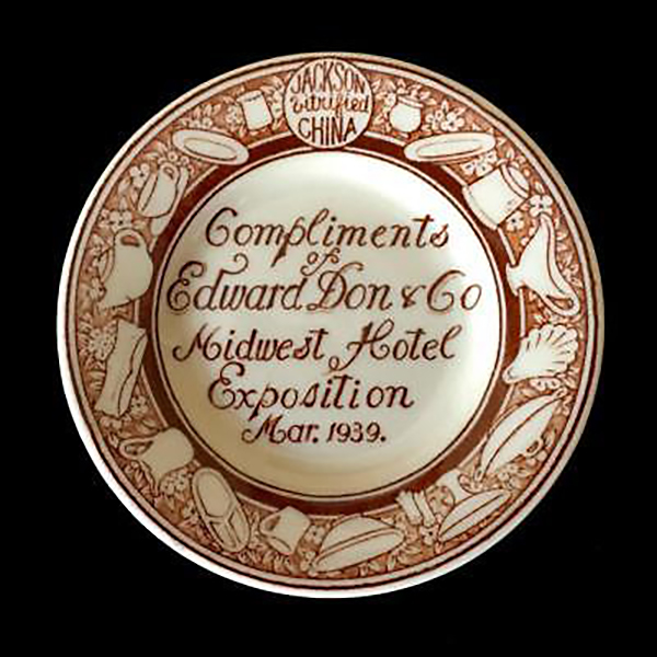
The Madness Has Begun!!!! Jackson Vitrified China sample butterpat made for the restaurantware supplier Edward Don and Co., and distributed as a giveaway at the Midwest Hotel Expotion, March 1939.


