Porcelain Madness: Difference between revisions
(date) |
|||
| (26 intermediate revisions by 2 users not shown) | |||
| Line 1: | Line 1: | ||
Welcome to '''Porcelain Madness''', a decorative annex to '''[http://MysticTeaRoom.com The Mystic Tea Room]''', where every piece of chinaware tells a story. This site showcases beautiful top-marked restaurant chinaware from around 1900 through the 1960s. Some of the pieces are displayed as is if an art museum, others form a sequence of cozy photos featuring plated food. | Welcome to '''Porcelain Madness''', a decorative annex to '''[http://MysticTeaRoom.com The Mystic Tea Room]''', where every piece of chinaware tells a story. | ||
May 23rd, 2024: This site showcases beautiful top-marked restaurant chinaware from around 1900 through the 1960s. Some of the pieces are displayed as is if an art museum, others form a sequence of cozy photos featuring plated food. | |||
<i><b>catherine yronwode</b><br>curator, historian, and docent | <i><b>catherine yronwode</b><br>curator, historian, and docent | ||
| Line 15: | Line 17: | ||
<center> | <center> | ||
<gallery widths="450px" heights="450px" perrow="2" align="left; cellspacing=8px; cellpadding: 5px 5px 5px 5px;"> | <gallery widths="450px" heights="450px" perrow="2" align="left; cellspacing=8px; cellpadding: 5px 5px 5px 5px;"> | ||
<!--This is a Hotel Grant Oakland Calif. custard / egg cup. It is a Shenango piece with the green outlined Native American on the backstamp. The Hotel Grant was at 2338 E. 14th St. [Now International Blvd]., near 23rd Avenue, and was advertised in the Oakland Tribune for May 1st, 1927 as "Just opened. Overnight and per week. Sunny, light rooms. Finest Box Springs and Hair Mattresses made. Steam Heat, Hot Water, Lobby Phones. Quiet and Homelike. We know you will like it. Inspection invited. One Block to S.P. [Southern Pacific railroad station at 16th St.], Key [Key Line trolley station]." I believe the building is still standing, although it has been converted to apartments with shops at ground level. It is in what is called the Fruitvale district, which is down by the railroad tracks and the Bay, a working-class neighborhood then, and worse now.--> | |||
File:Jackson-Green-Airplane-Greater-Rockford-Airport-Plate.jpg|A green airbrushed plate made by Jackson China in Falls Creek, West Virginia and topmarked for the Greater Rockford Airport in Rockford, Illinois. These plates also come in blue and rose-pink. They were made for use in the Greater Rockford Airport Restaurant. Plates have also been found with no topmark. The plane is a bit of a fantasy which most people identify as a DC-3. One of the things i love about this plate is that although the dominating image is a then-modern airplane flying above a city-scape, over on the left side there are stylized grasses, perhaps pasture land or stalks of wheat, which serve to remind us that even though Rockford had an airport, it was not far removed from its roots as a Midwestern prairie town. As the decades passed, Chicagoland grew and spread, and Rockford was subsumed by it; the airport is now known as Chicago Rockford International Airport. This piece is back-stamped with the so-called "vanishing Jackson logo" and was not date-coded, but we do know that construction of the Greater Rockford Airport and terminal began in 1954, during the era that decommissioned WWII military DC-3 airplanes were being shifted over to commercial use. The style of the plane and the "modernistic" narrow rim of the plate would seem to date this piece from 1955 to 1960. | |||
File:Jackson-On-Lock-Sam-7-inch-plate.jpg|On Lock Sam is a Cantonese Chinese restaurant in Stockton, California. The name On Lock Sam means "A Contented Heart" in Cantonese. According to an article in the San Joaquin Historian, the original On Lock Sam was located at 125 East Washington Street between Hunter and El Dorado. It was started by an unknown person in 1898. Wong Sai Chun and two partners bought the existing business in 1920. The restaurant became an significant center of Cantonese Chinese community life in Stockton and was known for hosting important cultural and family banquets. Wong Sai Chun passed away in 1953 and his son Jim S. Wong succeeded his father in the family business. The original building was demolished in 1964 and On Lock Sam moved to 333 South Sutter Street. In 2003, the restaurant closed for renovations and re-opened in 2004 with the name New On Lock Sam. The plate has a white body with a Blue Willow pattern in the center and two smaller Blue Willow depictions on either side, a blue stripe at rim, red On Lock Sam topmark and three red Chinese characters that read On Lock Sam. This 7-inch plate was made by Jackson China in Falls Creek, West Virginia, and is back stamped with a date-code for 1974; i have another, larger On Lock Sam plate by Jackson that is date-coded to 1978. | |||
File:Syracuse-Mulberry-Roosevelt-Hotel-New-York-Colonial-Room.jpg|A Syracuse China mulberry-on-white bowl in the Colonial Room pattern of the Roosevelt Hotel in New York City. The design is actually 19th century Aesthetic, not 18th century Colonial, comprised of mixed panels of art, alternating realistic florals and Asian architecture in the hodge-podge that characterizes Aesthetic style. In addition to mulberry, this design was also produced in pale blue. The Roosevelt Hotel, located at 45 East 45th Street, was built in 1924 by the New York Central Railroad and the New York, New Haven, and Hartford Railroad and was named in honor of U.S. president Theodore Roosevelt. It closed in 2020 during the COVID pandemic, reopened in 2023 as a migrant shelter, and will probably be demolished to make room for a skyscraper on the site. | |||
File:Kellogs-Cornflakes-Butter-Pat.jpg|Kellog's Toasted Cornflakes butter pat, made by O.P.Co. Syracuse China, circa 1920-1925. Because butter pats are generally too small to carry maker's marks or date-codes, what i know about this tiny dish has been gleaned from looking at other pieces in the series -- a breakfast plate, a celery dish, and the like. Those items are marked for O.P.Co. Syracuse, the maker, and Albert Pick and Co., Chicago, the distributor who took the order. They all date from 1920 to 1925. Syracuse was located in Onandaga, New York, and Albert Pick distributed restaurant ware to the upper Midwest. The Kellog's cereal company was located in Battle Creek, Michigan, and so it is likely that Kellog's Toasted Cornflakes pieces were not sold to restaurants but were used in the Kellog factory's cafeteria. | |||
File:Semon-Makes-Good-Ice-Cream-Plate.jpg|"Semon Makes the Best Ice Cream" is a slogan that apparently failed to raise a chuckle back in the 1920s. Semon's was produced in 'The Finest Ice Cream Plant in America, at 110 Bristol St, New Haven, Connecticut. The company's founder, John Semon, once celebrated his own humble beginnings by giving free trolley rides to 1,000 girls and boys who came to visit the plant, and were served with ice cream, lemonade, sandwiches, and a free trolley ride home. "The Cream of Perfection" was sold at drug stores, amusement piers, ice cream stands, and in hotels and restaurants throughout the state. This heavy ice cream dish is built like a miniature soup plate, but you could also buy Semon's ice cream in cones, as Eskimo pies, and in layered multi-flavoured bricks for use at parties. | |||
File:Originality-Plus-Divination-Tea-Cup.jpg|The Gypsy Teacup by Originality Plus, manufactured in Japan of white porcelain for an importer known as Bradley Exclusives. There are two variations: one with a free-hand scallop design around the saucer, and another with a more formal zig-zag design around the saucer. The symbols are tiny transfers, each contained within a circle; and because they are hand-placed, no two cups exactly the same. As the instruction sheet explains, due to the small size of the symbols, after noting the tea leaf patterns, one should use a chopstick to push them aside to reveal the symbols beneath. The page for the cup including all its detail is here https://www.mystictearoom.com/wiki/Originality_Plus_Gypsy_Teacup_Scallop_Design | |||
File:Grindley-Thomsons-Teal-White-Thornley-Soup-Plate.jpg|A soup plate for the Thompson's Lunch Room chain, in the Thornley pattern. John R. Thompson opened his first lunch room in Chicago in 1891 and by 1914 had a chain of 68 eateries in several cities. This early soup plate was manufactured by Grindley Hotel Ware in England, but from the 1930s through the 1950s, the company purchased restaurant ware from the Buffalo, Carr, and McNichol potteries. Thompson's was infamous for refusing to serve African-American customers. In 1944 the first mass sit-in against its Jim Crow policies was held in Washington, DC, by 200 students from Howard University. In 1950, Mary Church Terrell and other Howard activists again sought to desegregate Thompson's, under old Reconstruction laws that forbade discrimination, and in 1953, they won their case in the U.S. Supreme Court, | File:Grindley-Thomsons-Teal-White-Thornley-Soup-Plate.jpg|A soup plate for the Thompson's Lunch Room chain, in the Thornley pattern. John R. Thompson opened his first lunch room in Chicago in 1891 and by 1914 had a chain of 68 eateries in several cities. This early soup plate was manufactured by Grindley Hotel Ware in England, but from the 1930s through the 1950s, the company purchased restaurant ware from the Buffalo, Carr, and McNichol potteries. Thompson's was infamous for refusing to serve African-American customers. In 1944 the first mass sit-in against its Jim Crow policies was held in Washington, DC, by 200 students from Howard University. In 1950, Mary Church Terrell and other Howard activists again sought to desegregate Thompson's, under old Reconstruction laws that forbade discrimination, and in 1953, they won their case in the U.S. Supreme Court, | ||
| Line 23: | Line 38: | ||
File:Messingers-Plate-Stack.jpg|A soup plate with rose swags in green, marked for Messinger's Restaurant in Chicago, Illinois, made by Shenango, circa 1912-1922. Samuel P. Messinger was the proprietor and sales manager of this small chain of lunch rooms in Chicago and environs. Within it rests a small unmarked bread plate in the Marion pattern made by Mayer China, circa 1912 – 1935. Marion was a generic pattern of swags and swirls, but this plate, like many other Marion pieces, is back-stamped for the Horn & Hardart Automat restaurant chain based in New York City. | File:Messingers-Plate-Stack.jpg|A soup plate with rose swags in green, marked for Messinger's Restaurant in Chicago, Illinois, made by Shenango, circa 1912-1922. Samuel P. Messinger was the proprietor and sales manager of this small chain of lunch rooms in Chicago and environs. Within it rests a small unmarked bread plate in the Marion pattern made by Mayer China, circa 1912 – 1935. Marion was a generic pattern of swags and swirls, but this plate, like many other Marion pieces, is back-stamped for the Horn & Hardart Automat restaurant chain based in New York City. | ||
File:Greenwood-Monkey-Dish.jpg|A Greenwood monkey dish in the ever-popular and much copied leaf-and-ball design made by many pottery companies over the years, and sometimes known as "Richmond" among dealers. This is an early example, with the Greenwood backstamp impressed into the clay rather than applied as a underglaze decal. | File:Greenwood-Monkey-Dish.jpg|A Greenwood monkey dish in the ever-popular and much copied leaf-and-ball design made by many pottery companies over the years, and sometimes known as "Richmond" among dealers. This is an early example, with the Greenwood backstamp impressed into the clay rather than applied as a underglaze decal. | ||
| Line 38: | Line 51: | ||
File:Grindley-Green-White-Pomeroy-3-Individual-Creamers.jpg|Three individual green-and-white creamers made by Grindley Hotel Ware in the Pomeroy pattern. Grindley's green glaze is a lighter and yellower shade than the standard forest green so well known through green-stripe ware. These creamers are not back-stamped, but they accompany a plate backstamped as Grindley Hotel Ware / Made in England / "Pomeroy" / Huntington Paper & China Co. / Huntington, West VA." The American importation of English semi-vitreous chinaware for both domestic and restaurant use was common at one time, but importing it to West Virginia does seem like carrying coals to Newcastle, given the number of potteries in Appalachia at the time. | File:Grindley-Green-White-Pomeroy-3-Individual-Creamers.jpg|Three individual green-and-white creamers made by Grindley Hotel Ware in the Pomeroy pattern. Grindley's green glaze is a lighter and yellower shade than the standard forest green so well known through green-stripe ware. These creamers are not back-stamped, but they accompany a plate backstamped as Grindley Hotel Ware / Made in England / "Pomeroy" / Huntington Paper & China Co. / Huntington, West VA." The American importation of English semi-vitreous chinaware for both domestic and restaurant use was common at one time, but importing it to West Virginia does seem like carrying coals to Newcastle, given the number of potteries in Appalachia at the time. | ||
File: | File:Warwick-The-Claypool-Indianapolis-BW-Checkerboard-CS.jpg|A cup and saucer made for the Claypool Hotel in Indianapolis, Indiana, by the Warwick China Company in Wheeling, West Virginia. My husband nagasiva and i used to do freelance digital graphics and typesetting for a publishing company called Claypool Comics. When i found this set and an accompanying plate, i was pleased to see that the seller had two of these trios, so i bought both of them and passed the dupe set on to my old colleague Richard Howell, the chief editor, and a writer-artist, at Claypool. | ||
File:Shenango-Mobil-Flying-Pegasus-1980s-blue-red.jpg|A red, white, and blue tea cup and saucer made for the Mobil Oil company, featuring their iconic Red Pegasus logo. This was used in one of their many cafeterias, either on land or on an oil rig offshore. The pottery company is Shenango, the time ... mid-20th century, probably the 1980s. | |||
File:Spritzdekor-blue-plums-cake-plate-germany.jpg|"Spritzdekor" is German for "airbrushed decorations" -- and this is a German porcelain spritzdekor cake plate fitted into a nickel-plated holder with handles. The image, airbrushed in shades of indigo blue, depicts two leafy branches of Damson Plums ("Kriechen-Pflaume") in full fruit. I bought this cake plate on eBay years ago, and it came all the way from Germany. It is very nearly identical to a cake plate that my German-Jewish grandmother Ida had in her home. She called it a tortenplatte -- a plate for tortes. <!--Keramik Tortenplatten aus Porzellan Theodor Paetsch Steingutfabrik WE Paetsch Frankfurt/Oder Später VEB Art Deco Spritzdekor Kirschen Durchmesser Platte ca 26 cm --> | File:Spritzdekor-blue-plums-cake-plate-germany.jpg|"Spritzdekor" is German for "airbrushed decorations" -- and this is a German porcelain spritzdekor cake plate fitted into a nickel-plated holder with handles. The image, airbrushed in shades of indigo blue, depicts two leafy branches of Damson Plums ("Kriechen-Pflaume") in full fruit. I bought this cake plate on eBay years ago, and it came all the way from Germany. It is very nearly identical to a cake plate that my German-Jewish grandmother Ida had in her home. She called it a tortenplatte -- a plate for tortes. <!--Keramik Tortenplatten aus Porzellan Theodor Paetsch Steingutfabrik WE Paetsch Frankfurt/Oder Später VEB Art Deco Spritzdekor Kirschen Durchmesser Platte ca 26 cm --> | ||
| Line 57: | Line 72: | ||
File:Joes-snappy-service-green-stripe.jpg|A lovely green stripe restaurantware lunch plate with classic 1920s - 1930s lettering, made by Shenango for Joe's Snappy Service, a Michigan eatery of years gone by. Photo credit: Susan Phillips of the Restaurant Ware Collector's Network. | File:Joes-snappy-service-green-stripe.jpg|A lovely green stripe restaurantware lunch plate with classic 1920s - 1930s lettering, made by Shenango for Joe's Snappy Service, a Michigan eatery of years gone by. Photo credit: Susan Phillips of the Restaurant Ware Collector's Network. | ||
File:Green-Cross-Transferware-Waste-Bowl.jpg|Green Circle-in-Cross Transferware Bowl, made in England, 19th century. I bought this piece of low-fire earthenware (not my usual semi-vitreous ware) because i am a fan of green-and-white ware (who isn't?) and the circle-in-cross is part of my own signature. Also, it is in the Aesthetic genre, which i love. I suppose it to be late 19th century. | File:Green-Cross-Transferware-Waste-Bowl.jpg|Green Circle-in-Cross Transferware Bowl, made in England, 19th century. I bought this piece of low-fire earthenware (not my usual semi-vitreous ware) because i am a fan of green-and-white ware (who isn't?) and the circle-in-cross is part of my own signature. Also, it is in the Aesthetic genre, which i love. I suppose it to be late 19th century. | ||
File:Grimwades-Pudding-Cooker-Lid.jpg|Grimwade's Pudding Cooker, made in England. This is just the lid; the bottom bowl is also covered with lettering. | File:Grimwades-Pudding-Cooker-Lid.jpg|Grimwade's Pudding Cooker, made in England. This is just the lid; the bottom bowl is also covered with lettering. | ||
File:Sterling-red-white-triangle-7-inch-plate-forum.jpg|Sometimes the decoration of a retaurant plate is so amateurish or abnormal that it makes me wonder what the pottery company's distributor or rep thought of it. But, as they say, "The customer is always right," so here we have one of many bizarre examples of how the Toffenetti / Triangle restaurant chain in Chicago liked their plates to look in the early 1930s. The pottery company is Sterling, and i'll bet that some of the factory's decorators went home to migraine-inducing nightmares after 8 hours of looking at this pattern! | File:Sterling-red-white-triangle-7-inch-plate-forum.jpg|Sometimes the decoration of a retaurant plate is so amateurish or abnormal that it makes me wonder what the pottery company's distributor or rep thought of it. But, as they say, "The customer is always right," so here we have one of many bizarre examples of how the Toffenetti / Triangle restaurant chain in Chicago liked their plates to look in the early 1930s. The pottery company is Sterling, and i'll bet that some of the factory's decorators went home to migraine-inducing nightmares after 8 hours of looking at this pattern! | ||
File:Mayer-G-and-L-red-green-white-c-and-s.jpg|A mystery cup and saucer from the early 20th century. It was made by the Mayer China company and dates to the era of hand-striping, probably around the 1910s to 1920s, but the "G & L" logo turns up no restaurants, tea rooms, academic institutions, churches, fraternal organizations, factories, fire departments, or other of the "usual suspects" who customarily had their own sets of restaurantware. | |||
File:Queen-Anne-Lady-Lucky-Spades-Set-forum.jpg|A fine bone china tea cup and saucer set made by Shore & Coggins in the Lady Luck pattern at the Queen Anne Pottery in Staffordshire, England. The maker's mark dates it to between 1959 and 1966. The decoration is of playing cards, the front showing a royal flush, while on the back is a picture of the joker; there is also a joker on the inside of the cup. A small sandwich plate came with each set and the sets were made in four colourways: blue (hearts), green (diamonds), pink (clubs), and yellow (spades). I love this tea set for reading tea leaves, especially if the sitter has a question about luck! For hundreds of images of tea leaf reading sets, and instructions in tasseomancy, see our sister-site, [http://MysticTeaRoom.com The Mystic Tea Room]. | File:Queen-Anne-Lady-Lucky-Spades-Set-forum.jpg|A fine bone china tea cup and saucer set made by Shore & Coggins in the Lady Luck pattern at the Queen Anne Pottery in Staffordshire, England. The maker's mark dates it to between 1959 and 1966. The decoration is of playing cards, the front showing a royal flush, while on the back is a picture of the joker; there is also a joker on the inside of the cup. A small sandwich plate came with each set and the sets were made in four colourways: blue (hearts), green (diamonds), pink (clubs), and yellow (spades). I love this tea set for reading tea leaves, especially if the sitter has a question about luck! For hundreds of images of tea leaf reading sets, and instructions in tasseomancy, see our sister-site, [http://MysticTeaRoom.com The Mystic Tea Room]. | ||
File:Carr-Vitrified-China-Ad-Plate.jpg|Carr Vitrified China advertising butterpat, made in Grafton, West Virginia. Sample butterpats were given away at trade shows by restaurantware manufacturers during the inter-war period. This one is just a bit oversized for the usual butterpat, but it is certainly too small to qualify as a plate. It probably dates to the late 1930s. | |||
File:Jackson-Sample-Edward-Don-and-Co-Butterpat-Brown-1939.jpg|The Madness Has Begun!!!! Jackson Vitrified China sample butterpat made for the restaurantware supplier Edward Don and Co., and distributed as a giveaway at the Midwest Hotel Exposition, March 1939. | File:Jackson-Sample-Edward-Don-and-Co-Butterpat-Brown-1939.jpg|The Madness Has Begun!!!! Jackson Vitrified China sample butterpat made for the restaurantware supplier Edward Don and Co., and distributed as a giveaway at the Midwest Hotel Exposition, March 1939. | ||
</gallery> | </gallery> | ||
</center> | </center> | ||
Latest revision as of 09:35, 15 May 2026
Welcome to Porcelain Madness, a decorative annex to The Mystic Tea Room, where every piece of chinaware tells a story.
May 23rd, 2024: This site showcases beautiful top-marked restaurant chinaware from around 1900 through the 1960s. Some of the pieces are displayed as is if an art museum, others form a sequence of cozy photos featuring plated food.
catherine yronwode
curator, historian, and docent
Porcelain Madness
Special thanks to my dear husband and creative partner nagasiva yronwode for illustrations, scans, and clean-ups.
And now, let the madness begin!
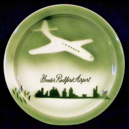
A green airbrushed plate made by Jackson China in Falls Creek, West Virginia and topmarked for the Greater Rockford Airport in Rockford, Illinois. These plates also come in blue and rose-pink. They were made for use in the Greater Rockford Airport Restaurant. Plates have also been found with no topmark. The plane is a bit of a fantasy which most people identify as a DC-3. One of the things i love about this plate is that although the dominating image is a then-modern airplane flying above a city-scape, over on the left side there are stylized grasses, perhaps pasture land or stalks of wheat, which serve to remind us that even though Rockford had an airport, it was not far removed from its roots as a Midwestern prairie town. As the decades passed, Chicagoland grew and spread, and Rockford was subsumed by it; the airport is now known as Chicago Rockford International Airport. This piece is back-stamped with the so-called "vanishing Jackson logo" and was not date-coded, but we do know that construction of the Greater Rockford Airport and terminal began in 1954, during the era that decommissioned WWII military DC-3 airplanes were being shifted over to commercial use. The style of the plane and the "modernistic" narrow rim of the plate would seem to date this piece from 1955 to 1960.
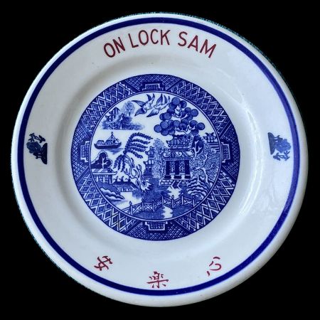
On Lock Sam is a Cantonese Chinese restaurant in Stockton, California. The name On Lock Sam means "A Contented Heart" in Cantonese. According to an article in the San Joaquin Historian, the original On Lock Sam was located at 125 East Washington Street between Hunter and El Dorado. It was started by an unknown person in 1898. Wong Sai Chun and two partners bought the existing business in 1920. The restaurant became an significant center of Cantonese Chinese community life in Stockton and was known for hosting important cultural and family banquets. Wong Sai Chun passed away in 1953 and his son Jim S. Wong succeeded his father in the family business. The original building was demolished in 1964 and On Lock Sam moved to 333 South Sutter Street. In 2003, the restaurant closed for renovations and re-opened in 2004 with the name New On Lock Sam. The plate has a white body with a Blue Willow pattern in the center and two smaller Blue Willow depictions on either side, a blue stripe at rim, red On Lock Sam topmark and three red Chinese characters that read On Lock Sam. This 7-inch plate was made by Jackson China in Falls Creek, West Virginia, and is back stamped with a date-code for 1974; i have another, larger On Lock Sam plate by Jackson that is date-coded to 1978.
A Syracuse China mulberry-on-white bowl in the Colonial Room pattern of the Roosevelt Hotel in New York City. The design is actually 19th century Aesthetic, not 18th century Colonial, comprised of mixed panels of art, alternating realistic florals and Asian architecture in the hodge-podge that characterizes Aesthetic style. In addition to mulberry, this design was also produced in pale blue. The Roosevelt Hotel, located at 45 East 45th Street, was built in 1924 by the New York Central Railroad and the New York, New Haven, and Hartford Railroad and was named in honor of U.S. president Theodore Roosevelt. It closed in 2020 during the COVID pandemic, reopened in 2023 as a migrant shelter, and will probably be demolished to make room for a skyscraper on the site.
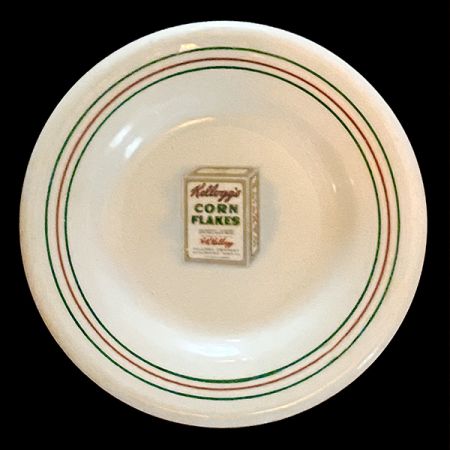
Kellog's Toasted Cornflakes butter pat, made by O.P.Co. Syracuse China, circa 1920-1925. Because butter pats are generally too small to carry maker's marks or date-codes, what i know about this tiny dish has been gleaned from looking at other pieces in the series -- a breakfast plate, a celery dish, and the like. Those items are marked for O.P.Co. Syracuse, the maker, and Albert Pick and Co., Chicago, the distributor who took the order. They all date from 1920 to 1925. Syracuse was located in Onandaga, New York, and Albert Pick distributed restaurant ware to the upper Midwest. The Kellog's cereal company was located in Battle Creek, Michigan, and so it is likely that Kellog's Toasted Cornflakes pieces were not sold to restaurants but were used in the Kellog factory's cafeteria.
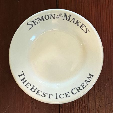
"Semon Makes the Best Ice Cream" is a slogan that apparently failed to raise a chuckle back in the 1920s. Semon's was produced in 'The Finest Ice Cream Plant in America, at 110 Bristol St, New Haven, Connecticut. The company's founder, John Semon, once celebrated his own humble beginnings by giving free trolley rides to 1,000 girls and boys who came to visit the plant, and were served with ice cream, lemonade, sandwiches, and a free trolley ride home. "The Cream of Perfection" was sold at drug stores, amusement piers, ice cream stands, and in hotels and restaurants throughout the state. This heavy ice cream dish is built like a miniature soup plate, but you could also buy Semon's ice cream in cones, as Eskimo pies, and in layered multi-flavoured bricks for use at parties.
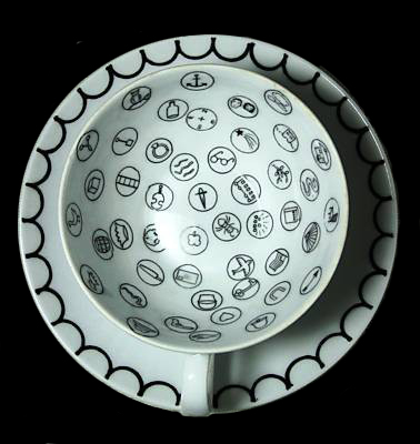
The Gypsy Teacup by Originality Plus, manufactured in Japan of white porcelain for an importer known as Bradley Exclusives. There are two variations: one with a free-hand scallop design around the saucer, and another with a more formal zig-zag design around the saucer. The symbols are tiny transfers, each contained within a circle; and because they are hand-placed, no two cups exactly the same. As the instruction sheet explains, due to the small size of the symbols, after noting the tea leaf patterns, one should use a chopstick to push them aside to reveal the symbols beneath. The page for the cup including all its detail is here https://www.mystictearoom.com/wiki/Originality_Plus_Gypsy_Teacup_Scallop_Design
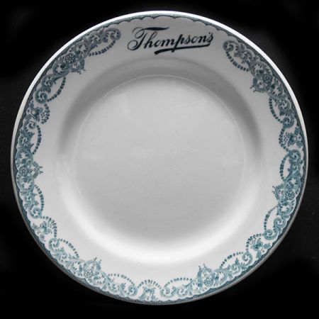
A soup plate for the Thompson's Lunch Room chain, in the Thornley pattern. John R. Thompson opened his first lunch room in Chicago in 1891 and by 1914 had a chain of 68 eateries in several cities. This early soup plate was manufactured by Grindley Hotel Ware in England, but from the 1930s through the 1950s, the company purchased restaurant ware from the Buffalo, Carr, and McNichol potteries. Thompson's was infamous for refusing to serve African-American customers. In 1944 the first mass sit-in against its Jim Crow policies was held in Washington, DC, by 200 students from Howard University. In 1950, Mary Church Terrell and other Howard activists again sought to desegregate Thompson's, under old Reconstruction laws that forbade discrimination, and in 1953, they won their case in the U.S. Supreme Court,
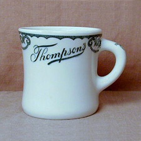
The backstamp on this mug reads "Made for Albert Pick & Co. / for J. R. Thompson's / Buffalo China / 1923." Albert Pick and Co. was a large restaurant ware distributor in Chicago, Illinois, which was also the headquarters of the Thompson's restaurant chain. By the 1960s there were 100 Thomson's lunch rooms, as the company actively bought up smaller chains and expanded into cafeterias and frozen foods until it was itself consumed by Green Giant Foods in 1971. Buffalo China was founded as the Buffalo Pottery in Buffalo, New York, in 1901 by John D. Larkin, head of the Larkin Soap Company to supply premiums for mail-order catalogue customers, but it grew into one of the largest manufacturers of vitrified and custom imprinted institutional, restaurant, railroad, steamship, and hotel ware in America.
A green and white stripe 19th century creamer, marked P.C.S.S.Co. for the Pacific Coast Steamship Company, made by Wood and Sons in England in their Acme pattern. The P.C.S.S.Co. line originated in 1867 as Goodall, Nelson, and Perkins, and took on the P.C.S.S.Co. name in 1876. The company was bonded as a common carrier in 1887, running between San Francisco and Port Moody, B.C., with short-run lines south to Santa Barbara. By 1900, offices in Seattle extended operations as far north as Alaska. In 1916 the P.C.S.S.Co. was sold to the Admiral Line, but its ships sailed on with P.C.S.S.Co. markings until ceasing passenger operations in 1936 and freight operations in 1938.
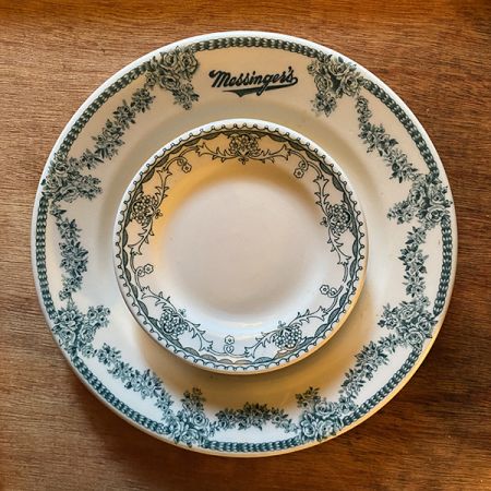
A soup plate with rose swags in green, marked for Messinger's Restaurant in Chicago, Illinois, made by Shenango, circa 1912-1922. Samuel P. Messinger was the proprietor and sales manager of this small chain of lunch rooms in Chicago and environs. Within it rests a small unmarked bread plate in the Marion pattern made by Mayer China, circa 1912 – 1935. Marion was a generic pattern of swags and swirls, but this plate, like many other Marion pieces, is back-stamped for the Horn & Hardart Automat restaurant chain based in New York City.
A Greenwood monkey dish in the ever-popular and much copied leaf-and-ball design made by many pottery companies over the years, and sometimes known as "Richmond" among dealers. This is an early example, with the Greenwood backstamp impressed into the clay rather than applied as a underglaze decal.
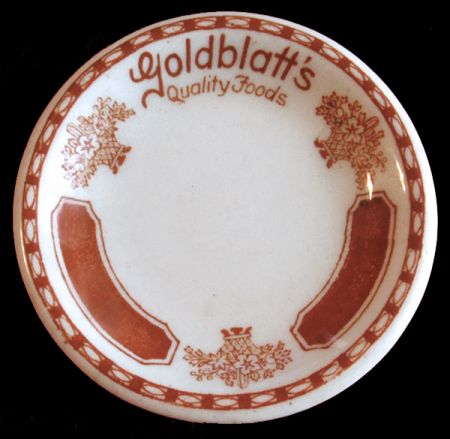
A butterpat in the Aristocrat design of panels and flower baskets, executed in a distinctive orange colour by Sterling China of Wellsville, Ohio, for the Goldblatt's department store chain headquartered in Chicago, Illinois. Sterling China was founded in 1917 and closed in 2003. Goldblatt's was founded in 1914, and in 1919 it moved to a 10-story building on State Street which included a restaurant. By the 1970s the chain included 47 stores throughout the Midwest, most or all of which had in-house restaurants. Alas, like many other department stores, Goldblatt's failed to adapt to online shopping, and thus it was liquidated in 2003. The exact manufacturing date of this particular butterpat is not indicated by a backstamp, but my guess is that it was made in the 1930s.
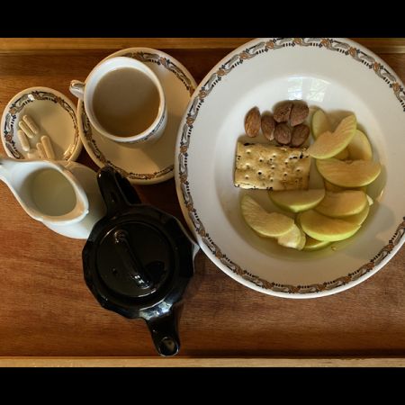
Breakfast in bed served on antique restaurant ware -- leafy "Glendale" by O.P.Co. Syracuse and a Black Doric teapot by Syracuse.. This morning's Glendale Special features Coffee with Milk, Apples from our Forestville orchard that were gathered by my loving husband nagasiva yronwode, a half dozen California Almonds, an assortment of vitamins, and a Zante Currant filled Crawford's Garibaldi Biscuit that came all the way from England!
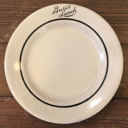
A bread plate from Burt's Lunch, made by Iroquois in their Iro-Tan cream colour, with single black striping and black lettering. The name of the restaurant could hardly be said to be in a font or to be a sample of sho-card lettering -- but it is nonetheless charming in its amateurish oddity. I am not sure where this eatery was located, but i do have a photo of a Burt's Dine and Dance Lunch on State Street in Newcomerstown, Ohio, with signage that indicated they also sold beer.
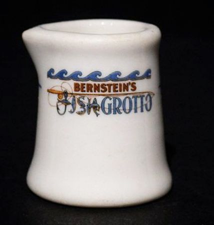
A creamer from Bernstein's Fish Grotto in San Francisco, California. This beautiful theme-park-like seafood restaurant was founded by Maurice Bernstein (1886-1932), and remained in operation from 1912-1981.
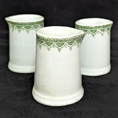
Three individual green-and-white creamers made by Grindley Hotel Ware in the Pomeroy pattern. Grindley's green glaze is a lighter and yellower shade than the standard forest green so well known through green-stripe ware. These creamers are not back-stamped, but they accompany a plate backstamped as Grindley Hotel Ware / Made in England / "Pomeroy" / Huntington Paper & China Co. / Huntington, West VA." The American importation of English semi-vitreous chinaware for both domestic and restaurant use was common at one time, but importing it to West Virginia does seem like carrying coals to Newcastle, given the number of potteries in Appalachia at the time.
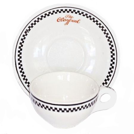
A cup and saucer made for the Claypool Hotel in Indianapolis, Indiana, by the Warwick China Company in Wheeling, West Virginia. My husband nagasiva and i used to do freelance digital graphics and typesetting for a publishing company called Claypool Comics. When i found this set and an accompanying plate, i was pleased to see that the seller had two of these trios, so i bought both of them and passed the dupe set on to my old colleague Richard Howell, the chief editor, and a writer-artist, at Claypool.
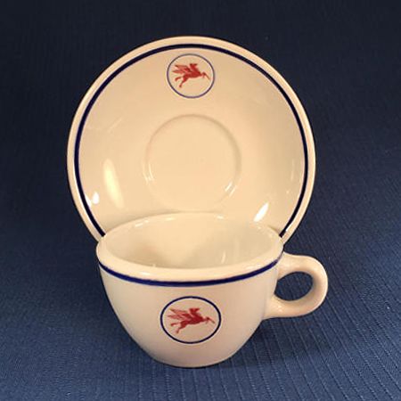
A red, white, and blue tea cup and saucer made for the Mobil Oil company, featuring their iconic Red Pegasus logo. This was used in one of their many cafeterias, either on land or on an oil rig offshore. The pottery company is Shenango, the time ... mid-20th century, probably the 1980s.
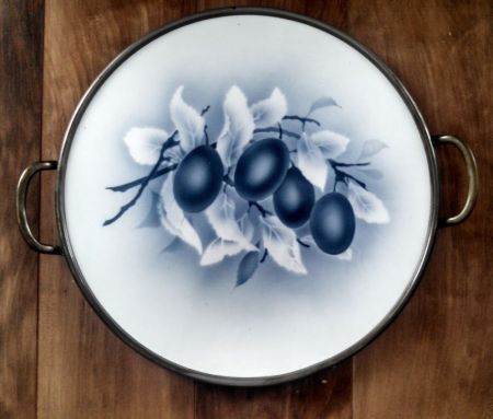
"Spritzdekor" is German for "airbrushed decorations" -- and this is a German porcelain spritzdekor cake plate fitted into a nickel-plated holder with handles. The image, airbrushed in shades of indigo blue, depicts two leafy branches of Damson Plums ("Kriechen-Pflaume") in full fruit. I bought this cake plate on eBay years ago, and it came all the way from Germany. It is very nearly identical to a cake plate that my German-Jewish grandmother Ida had in her home. She called it a tortenplatte -- a plate for tortes.
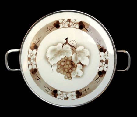
Here we have a German porcelain spritzdekor cake plate or tortenplatte fitted into a nickel-plated holder with handles. The image, airbrushed in shades of brown, depicts a leafy branch of Grapes. "Spritzdekor" is German for "airbrushed decorations." Comparing this one to the tortenplatte decorated with airbrushed Damson Plums ("Kriechen-Pflaume") in shades of blue indicates that they came from the same part of the world. They both date back to the 1920s and, truth to tell, i am more than a little obsessed with them.
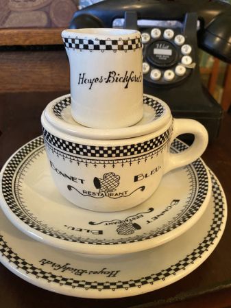
The stack of vintage black-and-white restaurant ware on which i ate my breakfast on January 13th, 2021. These pieces all feature checkerboard bands with picoté edging. The creamer, butterpat, and small plate were made for the Hayes-Bickford cafeteria chain and the cup and saucer were once property of the Bonnet Bleu restaurant.
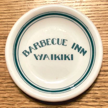
A small but mighty piece of restaurant ware from my collection. It is a butterpat from the Barbecue Inn in Waikiki, Hawaii Territory, made in the mid-1930s. The lettering is just amateurish enough to make me cringe, but the intention to hit the ultra-moderne-deco mark is so sincere that i am charmed. The Barbecue Inn was founded sometime after 1900 by Seihichi Shikata (1884-1931), born in Yokohama, Japan, and his wife Tsune Shikata (- 1932), born in Yamaguchi, Japan. When they died, the restaurant was carried on by their son Joseph Kiyoshi "Joe" Shikata (1906-1992), born in Waipahu, Hawaii. I think this butterpat dates from the era of the early proprietorship of Joe Shikata, circa 1932 - 1939. A 1933 advertisement lists the "Barbecue Inn at 2015 Kalakaua Ave., K. [Kiyoshi] Shikata, Mgr., Phone 91981."
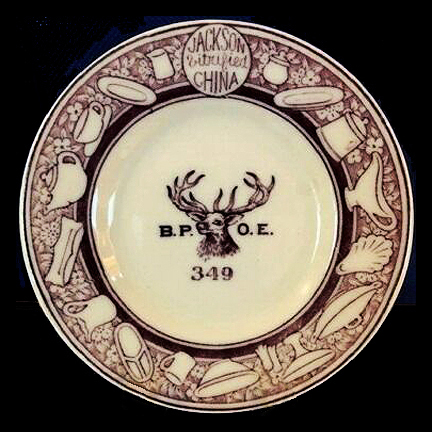
A Jackson Vitrified China butterpat made for the Benevolent and Protective Order of Elks, Lodge #349, Pride of Delaware, in Newark, Delaware. The Elks are a fraternal membership group that offers community building and charitable services. Elks greet one another with a cheerful, "Hello, Bill!" Their colour is purple and to them the 11th hour is the golden hour of recollection, the homecoming of those who wander, the mystic roll call of those who will come no more because, living or dead, an Elk is never forgotten, never forsaken.
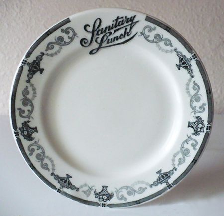
Sanitary Lunch plate by Scammel's China of Trenton, New Jersey. Because an unsanitary lunch plate is a bit on the dark side, even for Trenton.
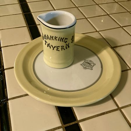
Preparing for breakfast with a vintage creamer and 6" plate. Eggs over easy and an English muffin are on the menu and will be complemented by this yellow and white service. The creamer was manufactured by Medalta Potteries of Medicine Hat, Alberta, Canada, and is back-stamped with the date-code 52, for 1952. It advertises the Nanking Tavern, a beloved Chinese restaurant which was located at the corner of Elizabeth and Hager streets in Toronto, Ontario, Canada. The plate is a mystery; it bears a conventional logo crest with a full-rigged sailing ship and the letters H MP H. The MP probably stands for a Scottish name, such as MacPherson or McPeak and the final H may possibly signify "Hotel" -- but precise identification has so far eluded me. In any case, the organization that used this crest was somewhere in the United States because the plate was made to order by Sterling China of East Liverpool, Ohio. The narrow rim and yellow / grey colourway give it a mid-century modern look and indeed its back-stamp date-code of A3 indicates that it was made in the year 1953.
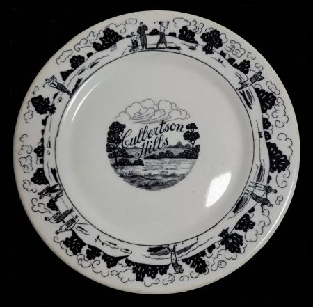
Here's a beautiful 6-inch black-and-white desert plate made by Warwick for the Culbertson Hills Golf Course in Edinboro, Pennsylvania in 1930, the year it opened. The artwork and lettering are superb -- and the same uncredited artist also produced a gorgeous matching brochure for the country club. I love lettering, i love art deco line art, i love cumulus clouds in art (and these are amazing clouds!) ... but i don't love the Culbertson Hills Golf Course, which advertised that it was "open to the pubic under restrictions which the company imposes, of course" -- specifically, that membership was offered "only to Gentile people." In other words, no Jews were allowed -- and neither were African Americans. I have no idea if or when Culbertson Hills changed its racial and religious exclusion policies, but this beautiful plate remains a symbol of the finest commercial art of its time, in the service of the ugliest discrimination of its time.
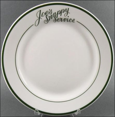
A lovely green stripe restaurantware lunch plate with classic 1920s - 1930s lettering, made by Shenango for Joe's Snappy Service, a Michigan eatery of years gone by. Photo credit: Susan Phillips of the Restaurant Ware Collector's Network.
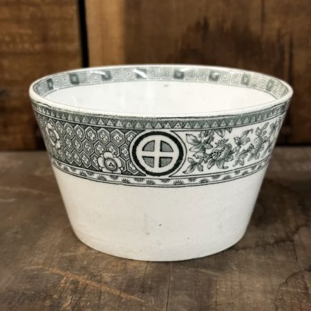
Green Circle-in-Cross Transferware Bowl, made in England, 19th century. I bought this piece of low-fire earthenware (not my usual semi-vitreous ware) because i am a fan of green-and-white ware (who isn't?) and the circle-in-cross is part of my own signature. Also, it is in the Aesthetic genre, which i love. I suppose it to be late 19th century.
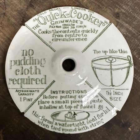
Grimwade's Pudding Cooker, made in England. This is just the lid; the bottom bowl is also covered with lettering.
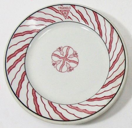
Sometimes the decoration of a retaurant plate is so amateurish or abnormal that it makes me wonder what the pottery company's distributor or rep thought of it. But, as they say, "The customer is always right," so here we have one of many bizarre examples of how the Toffenetti / Triangle restaurant chain in Chicago liked their plates to look in the early 1930s. The pottery company is Sterling, and i'll bet that some of the factory's decorators went home to migraine-inducing nightmares after 8 hours of looking at this pattern!
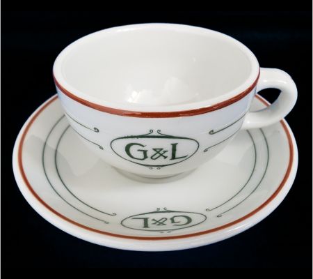
A mystery cup and saucer from the early 20th century. It was made by the Mayer China company and dates to the era of hand-striping, probably around the 1910s to 1920s, but the "G & L" logo turns up no restaurants, tea rooms, academic institutions, churches, fraternal organizations, factories, fire departments, or other of the "usual suspects" who customarily had their own sets of restaurantware.
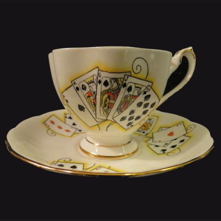
A fine bone china tea cup and saucer set made by Shore & Coggins in the Lady Luck pattern at the Queen Anne Pottery in Staffordshire, England. The maker's mark dates it to between 1959 and 1966. The decoration is of playing cards, the front showing a royal flush, while on the back is a picture of the joker; there is also a joker on the inside of the cup. A small sandwich plate came with each set and the sets were made in four colourways: blue (hearts), green (diamonds), pink (clubs), and yellow (spades). I love this tea set for reading tea leaves, especially if the sitter has a question about luck! For hundreds of images of tea leaf reading sets, and instructions in tasseomancy, see our sister-site, The Mystic Tea Room.
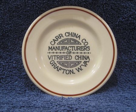
Carr Vitrified China advertising butterpat, made in Grafton, West Virginia. Sample butterpats were given away at trade shows by restaurantware manufacturers during the inter-war period. This one is just a bit oversized for the usual butterpat, but it is certainly too small to qualify as a plate. It probably dates to the late 1930s.
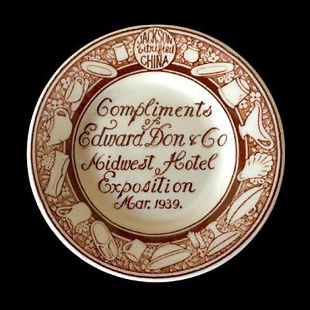
The Madness Has Begun!!!! Jackson Vitrified China sample butterpat made for the restaurantware supplier Edward Don and Co., and distributed as a giveaway at the Midwest Hotel Exposition, March 1939.


